
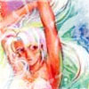
I'm trying to learn editing manga and I wanted to get some opinions on the sample page I did.
http://img152.imageshack.us/img152/6603/scanhmgcopyjl6.jpg
Any tips or suggestions on what to improve would be greatly appreciated.

Manga Poll

Manga is the Japanese equivalent of comics
with a unique style and following. Join the revolution! Read some manga today!
Join #baka-updates @irc.irchighway.net
RSS Feed
Forums
Learning to edit manga
From User
Message Body
Member
12:42 am, May 29 2008
Posts: 36

A bomb!
Member
2:46 am, May 29 2008
Posts: 479
I cant say anything that needs to be improved, it looks really nice. =D

Member
3:24 am, May 29 2008
Posts: 264
Can you post the original image for comparison ?
Member
3:27 am, May 29 2008
Posts: 36
@Nisseman Thanks
Here's the original Deva Sorry it's a big pic.
http://img520.imageshack.us/img520/1901/scanhmgrd1.jpg
Here's the original Deva Sorry it's a big pic.
http://img520.imageshack.us/img520/1901/scanhmgrd1.jpg
Member
3:31 am, May 29 2008
Posts: 264
Well for a first try pretty good, but the redraws look a bit messy, especially near the window, how much do you leveled the blacks ?
Member
3:39 am, May 29 2008
Posts: 36
I'm trying to get better with the clone tool so I'm going to be practicing on the various raws I have to improve.
I think it was 50 since I was using a tutorial so I just followed what it said.
I think it was 50 since I was using a tutorial so I just followed what it said.
Member
3:55 am, May 29 2008
Posts: 310
Don't stretch out your text like that.
Member
4:06 am, May 29 2008
Posts: 36
Do you have any advice on what the text settings should be?
Member
4:26 am, May 29 2008
Posts: 264
I don't know which tutorial you used, here the one I started with concerning typesetting : http://sen.monkey-pirate.com/t_edit-editing.html#text
I think it is quite a helpfull tutorial for starting, but I only edit for fun ;)
edit: Just saw the picture you used is form there, so I guess you already know that ^^
Here another link http://www.unblessed.net/guide/main.html
I think it is quite a helpfull tutorial for starting, but I only edit for fun ;)
edit: Just saw the picture you used is form there, so I guess you already know that ^^
Here another link http://www.unblessed.net/guide/main.html
Member
4:39 am, May 29 2008
Posts: 36
Thanks for the link to second site Deva. I'm going to read through it now plus some of the others I found. (^w^)
I'm going to be editing with a small group of friends so I'm happy they will have patience while I'm learning.
I'm going to be editing with a small group of friends so I'm happy they will have patience while I'm learning.
Member
5:13 am, May 29 2008
Posts: 6
5:13 am, May 29 2008
Posts: 6
-Wild Words don't have [ ]. So you must use another font for that in the translation note part. Becomes a sign like this instead -`, of [
- Make the text more centred in the speech bubbles.
- I find some "dirt" in the picture also.
- and "dear hana", "when I met saki" and "the end of genroku" should have a white line around the text.
Overall, good job.
And sorry for my terrible English.
________________
www.rippersanime.com
www.mydailymanga.com
www.jcafe24.net
Member
5:20 am, May 29 2008
Posts: 36
Thanks for you input crazyankan. I didn't even notice that. I'll make sure to use a different font when I need to use an [].
I did have trouble centering the text but I'll work on it.
I'll remember to add the stroke around the text next time too.
I did have trouble centering the text but I'll work on it.
I'll remember to add the stroke around the text next time too.
Member
7:21 am, May 29 2008
Posts: 264
Quote from crystalespers
I did have trouble centering the text but I'll work on it.
You use the center text option in Photoshop ?
Member
7:26 am, May 29 2008
Posts: 36
I did put the paragraph on center but it looked sort of weird.
Member
7:40 am, May 29 2008
Posts: 267
hmmm...
redraw looks bad, especially the bottom right and those are pretty simple redraws areas. Anywho, you have dust. for example the top right bubble has obvious dust.
"Dust" is stuff in white/black areas that shouldn't be there. you have more on the bottom left.
The text in the gray areas- "dear hana" etc. should be stroked a bit. like 2 px. 3 is pushing it. to me it looks like thoughts also, which you should make gray, like the other thoughts on the page.
Your thoughts on the bottom right need a period at the end. your text isn't centered in your bubbles, along with that it's a touch big, you should resize it based on need. for example the last bubble if you center the text they would most likely overlap. make sure to use the move tool. i am assuming you are using PS.
back to dust. the edge of the page on the right and bottom have dust where it should only be white.
oh and your tlers note is too big. you should make that smaller and try to keep that on the white area instead of plastering it over multiple spots.
I think that's about it...i'm just eyeballing it from the link
edit- just noticed crazy pretty much mentioned it all
Last edited by Varna at 7:50 am, May 29 2008
________________
HUBBY of DUBBY
