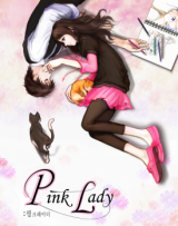
...but the content isn't. This is a webcomic. Now it's been published on paper, and usually each frame takes the whole width of the page.
First, I didn't find the art as beautiful as some previous comments said. There are some big mistakes, like transparent books (you can see the floor patterns through it). The artist uses too much some CG effects (I really don't like his oriented blur that is meant to show the character moves fast). IMHO, the mix of photographies with drawings, though not frequent, is a true failure. The drawings are at most average (no landscapes, scarce backgrounds, not very consistent characters). The only interest comes from some references to classic paintings, with a few drawings mimicking Chagall, Van Gogh...
As noted before, there are several pages repeating the same drawing (with minimal changes). It didn't recall me of NGE (where the still images came with sound, or already well-known characters and tension). I just felt the artist was lazy or late. And unrealistic: try holding a sketch book with your arm straight for a few minutes!
The story is cliché. A beautiful girl meets a beautiful guy. She's uneasy but he's cool and has tremendous talent. When they were children, they had a crush on each other. Nothing bad, but typical shoujo, isn't it?
I've just read 7 chapters, but I won't go farther.


