While I love reading manga that discuss manga itself, I found it hard to believe some of the content or relate to certain aspects, due to the manga’s often goofy tone. The one-shots in this volume recount Tezuka’s early struggles with manga, many of them overlapping and describing the same period.
The quality of storytelling and narration in manga format—such as how sequences transition from one to another—is not particularly high and sometimes feels a bit amateurish. Many one-shots come across as goofy, due to silly drawings, visual execution, or story choices.
An exception is Chapter 6 ("Animal Tsuregurezusa" ), which is the best story in the volume. In this chapter, art and story complement each other to present a touching retelling of two animal tales. If you only read one story from this volume, make it this one. The art here is also distinctively different from Tezuka’s usual style, evoking French cartoonists. The layout of the tiny panels is also quite unique, making this short story a standout.
As for the artwork, specific chapters—1, 2, 6, and 7—are of very high quality.
Chapter 7 ("Dotsuitare" ) felt like a pastiche of various Tezuka drawing styles. After reading the explanation at the end, it became clear that this chapter consists of excerpts from a longer story, which made sense in retrospect.
Overall, while Chapters 1, 2, and 7 aren’t my favorites in terms of storytelling, they stand out visually, with incredible manga art. However, they lack the strong character expressions seen in most manga, with the exception of Chapter 2. Manga artists often excel at conveying emotions with minimal lines. Nevertheless, the paneling, despite being from the 1970s, is mind-blowing due to Tezuka’s constant innovation and experimentation. It’s a feast for the eyes!
For instance, there’s a panel where a character clings in fear to the edge of the frame as if it were a lamp post. Another page uniquely splits panels in a kind of hexagon way while still preserving readability. One of the most striking pages depicts a character contemplating cannibalism due to hunger, with the page sliced in an unorthodox way, indicating his descent into madness.
There's also beautiful full-page drawings (actually all of the full-page drawings are exceptional), one example being a page depicting towering skyscrapers.
There's a brilliant page-long panel that doesn't extend across the entire width of the page which displays ink from an ink pot, trickling down the stairs of Tezuka's university lecture hall, as he draws manga during a lecture.
There’s a sketchy line drawing of Tezuka himself, visibly shaking while the town was bombed, which is drawn perfectly.
Another very unique panel, stretching across the width at the end of a page that's rotated sideways, shows a character walking through the ruins of Osaka. While it wasn’t ideal for readability, it was impressive and unlike anything I’ve seen before.
There are plenty more examples of unique paneling and storytelling techniques in the manga. These are just a few that made a big impression to me.
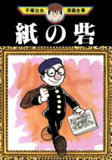
In terms of character art, I appreciated Chapter 2's ("Paper Fortress" ) cartoony plasticity of the characters. It reminded me of Fleischer cartoons and had consistently great character art and expressions.
The backgrounds are also stellar, packed with details, and the linework is exceptional and employed for all uses without cutting corners. He is a true auteur of the manga artform and this volume is a good example. Maybe not consistently due to the stories being published over many years in different manga magazines but could definitely put to shame modern artists with how in-depth he was thinking on how to layout scenes and display in unique ways the different emotions & occurences portrayed in the story.
There are a few examples though where his art has incorrect or non-sensical use of city illuminations. I've seen this before in other manga of his such as Thunder Mask.
His need for constant innovation though and pushing the boundaries of the medium is ever-present and evident here. This is especially impressive given how overworked he was. He was definitely not cutting corners or making it easy for himself.
Regarding the release itself, it would benefit from clearer, high-quality scans to truly appreciate the artwork or even a proper book format release. The translation is often nonsensical or includes grammatical errors but it never detracts from the story from some reason.
Many thanks to 5MENP for releasing this!