i'm not going to the anime expo. but i like the t-shirt idea

here's my version... see if you like it:
http://img79.imageshack.us/img79/3329/tshirttemplatev4.pngit's not done right... but i made it so that you get the design.
changes:
change the "baka" color from blue to red on both front and back.(same color as one of the previous t-shirts.)
resized the Baka manga updates sign.... made it smaller to fit the t-shirt... and for it not to be on the shoulders.
moved the "the mu community" a little down.
should add a "join" a little above it.(same font, same color.)
added the mu main logo from the front... put it at the bottom of the back. .... not the exact bottom.. since it would look like shit.
added a hierarchy between the mods, admins, whatever. (you can see the arrows, that's the hierarchy lol. i added that so it doesn't look like one of those firm t-shirts some people were talking about.) i think it looks better this way.... like a single image. (since i'm a scanlator... i'm not really fond of being below an updater. cuz mainly..... we're the ones that scanlate and provide the stuff for you.... and once we're done.... we're also the ones who update. but meh whatever....)
deleted the "s" in "scanslators"
should add an "s" on forumites.
oh i also resized everything except the "baka manga updates" sign, and the main logo from the bottom. resized it to get a little more space, and to fit better in the t-shirt.
Let me know opinions please
________________
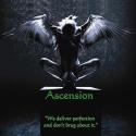
We deliver perfection and don't brag about it.


 Member


 and a MU logo on the front same as the original.


 )
)