
As you can probably tell, I widened the site a bit. Most people have monitors that are larger than 800x600 these days, so this shouldn't be that big of a deal to most of you. If you find something that doesn't look quite right (compared to how it did before), please report it to me (or post it somewhere...)
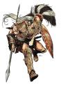
For those of you keeping track, yes, this is our first site design change in the history of MU (that's over 5.5 years). Since I suck at design (and hence, cannot fix the banner), I cheated, and made the right sidebar go up to the top of the screen. It opened a good spot for our totally awesome mascot, so I think it works. We'll see how people react ...
In case it doesn't quite look right, reload your page a few times. This should update your style sheets. Or just clear your cache
Update 1 Fixed bugs, also, I increased the size for author/series images, so they can be 300pixels wide now.
Update 2 Banner was extended so that it fits the whole width, so the search bar has moved back to its original place

Manga Poll

Manga is the Japanese equivalent of comics
with a unique style and following. Join the revolution! Read some manga today!
Join #baka-updates @irc.irchighway.net
RSS Feed
Forums
Small Site Layout Change
From User
Message Body

8:25 pm, Jan 10 2010
Posts: 2658

Lowly Member
Member
9:36 pm, Jan 10 2010
Posts: 3888
Finally some change!
xD
Now how about that new layout, Manick? Eh, eh? ;D *nudge*
________________
♪MONSTARR~ will eat all your cookies and steal your bishies~♪ Φ_Φ
xD
Now how about that new layout, Manick? Eh, eh? ;D *nudge*
________________
♪MONSTARR~ will eat all your cookies and steal your bishies~♪ Φ_Φ

Mome Basher
Member
9:37 pm, Jan 10 2010
Posts: 3380
If this was facebook, I would've hit the Like button =D
Finally, the width of the site is bigger that 1/3 the width of my screen >=D
________________

Everyday I'm tumblin'
Finally, the width of the site is bigger that 1/3 the width of my screen >=D
________________
Everyday I'm tumblin'
Mome Basher
Member
9:39 pm, Jan 10 2010
Posts: 3380
haha yeah!
How bout it xD
Also, in regards to the banner, why not get a temporary re-design before we go full revamp? I'm sure there are a bunch of members who could do a decent enough job =D
________________
Everyday I'm tumblin'
How bout it xD
Also, in regards to the banner, why not get a temporary re-design before we go full revamp? I'm sure there are a bunch of members who could do a decent enough job =D
________________
Everyday I'm tumblin'
Site Admin
9:41 pm, Jan 10 2010
Posts: 40
i don't like the change... having the mascot on the right forces the search bar up and it just doesn't look right to me...
Mome Basher
Member
9:44 pm, Jan 10 2010
Posts: 3380
Also (another one xD )
Is the signature image width limit increased now or will it remain the same?
________________
Everyday I'm tumblin'
Is the signature image width limit increased now or will it remain the same?
________________
Everyday I'm tumblin'
Member
9:45 pm, Jan 10 2010
Posts: 3120
Why does the mascot lead to blak?

Member
9:52 pm, Jan 10 2010
Posts: 29
I'm glad that I'm not the only person that doesn't like the search bar being in that location
Site Admin
9:52 pm, Jan 10 2010
Posts: 2275
because he was the one that created the mascot.
________________
"Officially, this machine doesn't exist, you didn't get it from me,
and I don't know you. Make sure it doesn't leave the building."
________________
"Officially, this machine doesn't exist, you didn't get it from me,
and I don't know you. Make sure it doesn't leave the building."
Mome Basher
Member
9:52 pm, Jan 10 2010
Posts: 3380
10:00 pm, Jan 10 2010
Posts: 2658
here is a temp image with the mascot on the top... I didn't have time to clean it up though.
http://www.mangaupdates.com/test.jpg
You think it looks better?
http://www.mangaupdates.com/test.jpg
You think it looks better?
Member
10:02 pm, Jan 10 2010
Posts: 2
10:02 pm, Jan 10 2010
Posts: 2
It looks better in the image you provided...
Member
10:10 pm, Jan 10 2010
Posts: 29
I think that it looks better than what we currently see.
Personally I would just get rid of the "mascot", it serves no purpose and just clutters up the page.
Personally I would just get rid of the "mascot", it serves no purpose and just clutters up the page.
10:15 pm, Jan 10 2010
Posts: 2658

Member
10:18 pm, Jan 10 2010
Posts: 8
It looks better, but it will be even better if the "Mascot" title wasnt there.
