
I'm currently using the default res, 1024x768. I'm sure most of you are using this resolution.
And my problem is. Am I using the right res ? The site is way too narrow for me to browse around, Not like I dislike it, but there are lots of space left you can use. =O
I hope my post is understandable. If not, I'll elaborate more.

Manga Poll

Manga is the Japanese equivalent of comics
with a unique style and following. Join the revolution! Read some manga today!
Join #baka-updates @irc.irchighway.net
RSS Feed
Forums
Best viewed resolution for this site
From User
Message Body

Member
8:20 pm, Feb 27 2007
Posts: 18

Member
8:24 pm, Feb 27 2007
Posts: 555
The site is set for the lowest common denominator, which is 800x600 (I think). I've always thought it needed settings for other resolutions, too, but we'd need a customizable title picture or something.
________________
https://twitter.com/Hostile
________________
https://twitter.com/Hostile

GrandDuch Awesome
Member
8:25 pm, Feb 27 2007
Posts: 169
Well...leaving unused space I find is easier to navigate. It doesn't become a crowded mess.
How is the site too narrow for you to browse around? Care to explain?
Edit: I'm using 1280x1024 resolution if your wondering and find it fine.
How is the site too narrow for you to browse around? Care to explain?
Edit: I'm using 1280x1024 resolution if your wondering and find it fine.

8:27 pm, Feb 27 2007
Posts: 2658
Honestly I would love new breathing room. I've long gotten sick and tired of this dreaded 539 pixel wide box that I have to deal with here. The problem is finding someone that can do a professional (and suitable) redesign of the site @_@... I'm a pretty picky guy.

8:34 pm, Feb 27 2007
Posts: 10661
Actually, we DID put out a request for a person to help redesign the site, but no one offered...So...any of you good enough to help out?
________________
A just ruler amongst tyrants
________________
A just ruler amongst tyrants
Member
8:48 pm, Feb 27 2007
Posts: 18
Quote
How is the site too narrow for you to browse around? Care to explain?
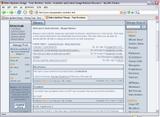
Well, I put the link of the image here to make it easier. This is 1280x1024 resolution that you find it fine. But the problem still remains like 1024x768.
CLICK ME
You notice the 5 cm white blank space between left and right ? That's what I mean.
Edit. And to admins, sorry I'm not a HTTP expert. I can't help. =(
Member
11:53 pm, Feb 27 2007
Posts: 4
11:53 pm, Feb 27 2007
Posts: 4
Well if there was someone good enough with html, the width could be relative to the resolution of the screen, but it is harder to make (Well for a noob like me it is). A lot of websites just leave it so that even 800x600 could view it such as Naruto Fan.
________________

________________
Member
5:40 am, Feb 28 2007
Posts: 486
5:40 am, Feb 28 2007
Posts: 486
that explains a lot i was wondering why the site had so much unused space
________________
| One Punch Man | Noblesse | Nanatsu no Taizai | Gun x Clover |
________________
| One Punch Man | Noblesse | Nanatsu no Taizai | Gun x Clover |
Member
12:52 pm, Mar 1 2007
Posts: 630
12:52 pm, Mar 1 2007
Posts: 630
Well I run on a resolution of 1280x1024 but I only have the width of the window at about 2/3 to 4/5 and the height at about 2/3. If I go full screen, I reminds me of popups that engulf my screen. 
 ;)
;)
So the width of the screen is closed in but I personally wouldn't stretch it out too much.

It doesn't look too bad overall if one leaves the window wide enough to have the empty space on the sides.
Well these are the squished areas as I see it, marked in the dark purple. But really the area that I marked in light purple bothers me more because that area is hard to read (not that it needs to be referred to a lot). I always worry about the colour of the page not having enough contrast and that I have to strain my eyes more to look at it but...blah, it's not like I can fix it. ^^;
(Okay, I guess ImageVenue and the b-u page has decided to get mad at me after the other two photos. I'm having problems with this one.
I got an error.
On Image: http://img23.imagevenue.com/loc16/th_85397_mangaupdates_hom e_wide_marked_122_16lo.JPG (only the thumbnail image)
We need an extention of the image to be either *.gif, *.png, or *.jpg. Sorry. Is it because of the .JPG instead of .jpg?
Oh geez, it's got to be that the "checker" doesn't like me thumbnailing it...)

FINALLY!
Last edited by Takiko at 1:53 pm, Mar 1 2007
________________
My avatar was Yves Saint Laurent's The Black Evening Dress (with big bow) first shown in 1983, photographed from his 2002 retrospective and final show. [color=#CC0066]Check out some of his collections for free (pre-2008) HERE[/color] courtesy of FirstView.
;)So the width of the screen is closed in but I personally wouldn't stretch it out too much.

It doesn't look too bad overall if one leaves the window wide enough to have the empty space on the sides.

Well these are the squished areas as I see it, marked in the dark purple. But really the area that I marked in light purple bothers me more because that area is hard to read (not that it needs to be referred to a lot). I always worry about the colour of the page not having enough contrast and that I have to strain my eyes more to look at it but...blah, it's not like I can fix it. ^^;
(Okay, I guess ImageVenue and the b-u page has decided to get mad at me after the other two photos. I'm having problems with this one.
I got an error.
On Image: http://img23.imagevenue.com/loc16/th_85397_mangaupdates_hom e_wide_marked_122_16lo.JPG (only the thumbnail image)
We need an extention of the image to be either *.gif, *.png, or *.jpg. Sorry. Is it because of the .JPG instead of .jpg?
Oh geez, it's got to be that the "checker" doesn't like me thumbnailing it...)

FINALLY!
Last edited by Takiko at 1:53 pm, Mar 1 2007
________________
My avatar was Yves Saint Laurent's The Black Evening Dress (with big bow) first shown in 1983, photographed from his 2002 retrospective and final show. [color=#CC0066]Check out some of his collections for free (pre-2008) HERE[/color] courtesy of FirstView.
Member
12:55 pm, Mar 1 2007
Posts: 154
12:55 pm, Mar 1 2007
Posts: 154
Hmm..I'm on 1600x1200 and the empty space doesn't bugs me at all, I find it comfortable that everything is close and I don't need to drag my mouse all over the screen to get to links.

Member
1:14 pm, Mar 1 2007
Posts: 45
I'm using 1280x800 and for me everything seems fine.
GrandDuch Awesome
Member
1:57 pm, Mar 1 2007
Posts: 169
Oh the reason I'm not having a problem because when I'm reading I tend to increase the font size. Currently using mozilla firefox as a browser and just hold ctrl+ scroll up on the mouse.
This makes everything bigger but there are a few problems with it on some sites. Sometimes the words jumble up onto images or they just can't be seen anymore but I still prefer it because I sit pretty far away.
This makes everything bigger but there are a few problems with it on some sites. Sometimes the words jumble up onto images or they just can't be seen anymore but I still prefer it because I sit pretty far away.

Site Admin
7:19 pm, Mar 4 2007
Posts: 139
Nowadays, I think that most of the people use a 1024x768 pixels resolution.(or higher). Those who are still with 800x600 probably are still on windows 98 .... 
I think that a fixed width design is much pretty that a width that fit the resolution of the user, because there will be a lot of blank space if you are in 1600x1200, and the design wouldn't look the same.
A design that fit the resolution is not ask the moon, but we couldn't make a header like in this design (that has a fixed width).
Personnaly, I would vote for a multi-resolution design, with an option to fixe the width, or to sketch it, depend on the user choice. (it's possible! ... I can do it if you need help.)
________________
This is a Signature .... I haven't put in some huge images! Are you happy now ?
7:25 pm, Mar 4 2007
Posts: 10661
Wait, so you're in web design?
________________
A just ruler amongst tyrants
________________
A just ruler amongst tyrants
Site Admin
8:47 am, Mar 5 2007
Posts: 139
mmm. .... yes 
________________
This is a Signature .... I haven't put in some huge images! Are you happy now ?
________________
This is a Signature .... I haven't put in some huge images! Are you happy now ?
