


Small Site Layout Change
16 years ago
Posts: 40
hey manick ^_^
if you want to keep it find someone to make a new banner that incorporates the mascot. i think having manga characters in the banner is biased towards certain mangas so having the mascot being the center of attention would be a lot better.
16 years ago
Posts: 6
the layout didn't work here .-. it's weird and things on the bottom are on top of each other

16 years ago
Posts: 29
test 2 is the best so far.
btw, when I mentioned getting rid off the "mascot" in my previous post I meant the stupid mutated Pikachu rip-off, not the word "mascot" lol

16 years ago
Posts: 8
Lol, while I was writting you removed the Mascot title, but try to leave both columns at the same height, I think thats why it looks off in some way.
16 years ago
Posts: 1966
You have to reload the page for a few times. D: Same thing happened with me, might be a browser problem though. Using IE
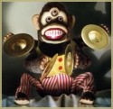
[img]http://28.media.tumblr.com/tumblr_lq2hczRc5d1r1rvcno1_500.gif[/img]
Monkeys, always at your service.
Quote from NightSwan
I have to thank you again. It's been a while since I've had this much d**k on my computer. :'3
16 years ago
Posts: 1966
No need to insult the mascot. .___. Blak worked hard on that.
I like the mascot...;___;
[img]http://28.media.tumblr.com/tumblr_lq2hczRc5d1r1rvcno1_500.gif[/img]
Monkeys, always at your service.
Quote from NightSwan
I have to thank you again. It's been a while since I've had this much d**k on my computer. :'3
16 years ago
Posts: 29
Well it is a Pikachu rip-off.....
The whole concept of Manga Updates having a mascot (no matter what it looks like) is stupid, it serves no purpose

16 years ago
Posts: 8
-nods- Test 2 pic looks better.
I agree, too. Lower the right column down to the same height as the left column. It makes me want to literally push down the right column to make it even x-x;;
[img]http://i142.photobucket.com/albums/r97/xkat8/fahUQ.png[/img]
Click, register, join, post a few on Solia!
[img]http://i142.photobucket.com/albums/r97/xkat8/yohvsharuna.gif[/img]
16 years ago
Posts: 2275
[url]http://img191.imageshack.us/img191/2608/usercpm.png[/url]
The icons in the User CP need to be rearranged.
[color=green]"Officially, this machine doesn't exist, you didn't get it from me,
and I don't know you. Make sure it doesn't leave the building."[/color]
16 years ago
Posts: 1966
Stupid question...but does this mean the character limit (for width anyway) for sigs has also changed? .__.
[img]http://28.media.tumblr.com/tumblr_lq2hczRc5d1r1rvcno1_500.gif[/img]
Monkeys, always at your service.
Quote from NightSwan
I have to thank you again. It's been a while since I've had this much d**k on my computer. :'3
16 years ago
Posts: 3120
When the mascot title is removed, the mascot picture should be moved up a bit to fill in the gap left by the title's previous position
16 years ago
Posts: 1966
Ohh good. I wasn't the only one wondering the same. >=D
[img]http://28.media.tumblr.com/tumblr_lq2hczRc5d1r1rvcno1_500.gif[/img]
Monkeys, always at your service.
Quote from NightSwan
I have to thank you again. It's been a while since I've had this much d**k on my computer. :'3
16 years ago
Posts: 6221
Most likely...Manick, are you gonna work on the other parts of the site as well? since the gaps between columns in different parts of the site now looks too wide

16 years ago
Posts: 3380
If you don't like it, GTFO.
The mascot is quite special to the old-timers.
It reminds us of the time when the forum really got together and put themselves out there to enter the mascot competition. It symbolizes a sense of community.
Just putting it down as purposeless and a "pikachu rip-off" is down right offensive.
Besides...what's so "pikachu-ish" about it anyways? The ears? well, you need to get out there and realize that there are many character designs with similar ears, not just pikachu.
Furthermore, considering your lack of activity on the forums, I don't see why you should even give a damn about the mascot.
16 years ago
Posts: 3380
I don't see the problem >_>
