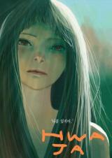
The manga is a very nice short thriller read. The artwork is something entirely different, similar to American comics, and utilizes its limited color palette extremely well. In the beginning (Ryu's childhood) & towards the end (Ryu's adulthood), there is a more organic flow of colors and which represented a type of peace that Ryu achieved. However, in the middle, this "organic" flow is disrupted, instead using high-contrast 3-5 color palette, and is used to portray uneasiness, paranoia, and uncertainty. The drawing style also shifted into more "boxy & choppy" figures that forces the reader to readjust their security to level with Ryu. I thought the mangaka really knew what he was doing and I loved it, but this may not come across clear to others and may not be well received.
Besides the artwork, I felt the story was more powerful in an implied-tone rather than outright. During this implied-tone, (ie Hwaja's sexual abuse, the secret behind Jay's death, the dead children, the secret of the town, etc.), it felt like you had to keep secrets, just like Ryu and Jay. You always knew, like Ryu and Jay. Even right up to the end was implied as well. This is such an immersive way to allow readers to fully experience the paranoia as well.
@EVgenijM86; I respect that the manga may not have been your favorite but what you choose to actually focus on despite the apparent abuse throughout the entire read... I can tell you must have just flipped through the manga. I would have respected your review more if you had mentioned WHY you hated the ending, instead of your awful summarizing of the entire manga in your shallow understanding.


