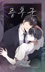
I picked this up on a whim because I really enjoy reading about red/black-flag semes (not because I find them hot, but because 1. it's fun to read about a personality type I'll never voluntarily interact with irl, 2. it's very entertaining to see what kind of absurd plotlines authors will come up with, and 3. some of these characters are such terrible people that when I think about them, I laugh.) Like other reviews say, this is a Stockholm Syndrome story, and f-ed up stuff starts happening the moment you open chapter 1. It's honestly not even worth searching up the title unless you're into this type of story.
I finished this in one day. It wasn't terrible, but it wasn't particularly enjoyable either. None of the characters except for 1 (Seungju) are decent/vaguely likeable people. That wasn't a big deal to me; I like it when the main characters are deeply flawed. The events/plot were absurd, dramatic, and pretty paper-thin as far as being a tool to showcase any sort of development or change in the characters/their relationship. That wasn't a big deal to me either; I walked into the story expecting such, and none of the events that happened were crazier than things I've read in other manhwas.
My main problem with this series is the art. The art style started very simple, naive, and immature, since this is an earlier/old(er) work from the authors. Usually the art style improves throughout the series, and while the art in this one did change, it... got worse.
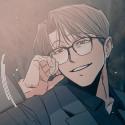
I have no idea how to describe it besides the fact that every character BUT the MC (Jeong-in) looked normal. He looked fine for the first 20-something chapters, and then they started doing this weird shading thing with his lips, constantly drew his forehead really small, and made his bottom eyelashes much more noticeable/longer than his upper ones, to the point they looked like cobwebs beneath his eyes. Not to mention the way anything liquid on the skin was rendered (like sweat) in a way that made it look slightly metallic, goopy, and slimy, and it was so distracting to look at that it completely ruined every single smut scene. On top of that, many of the lightsabers looked like whoever did the censoring actually gave them a glowing outline, and I hate that. I have no clue how I read through the entire thing without having to put it down because of the art.
I cannot believe that out of all the flaws with this series, my biggest problem was with the art.
TL;DR I hate how the MC is drawn. It's bad enough that it overshadows every other criticism I could make about this series.