


Mu T-Shirt
16 years ago
Posts: 6221
Thanks, if you guys are willing to do your suggestions, it helps me out a lot since RL problems are starting to take over again...
And I'm working on remaking the logo thanks to suggestions from Scy...hope that's okay lambs?
16 years ago
Posts: 4917
I like Calibers version with the logo, as well.
Red works better than Purple, with those colors.
And it fits with the "Madness" thing at the bottom.
If I can help as well, I'd be willing to.
16 years ago
Posts: 2275
Here are some other changes from the Blak's v2.
1
2
The only difference between the two images is the font on "Come And Partake In The Madness" at the bottom of the shirt's back. The second has left4dead font.
The overall changes of Blak's v2 are as follows:
Added text under his character on the front
Changed the color scheme for the Baka-mangaupdates logo (one for the front and one for the back... mostly for choice options but I though it looked nice/interesting that way)
Moved the forum rankings closer together slightly
Changed the separation line's, "The MU Community," font
Moved the MU logo on the front up and over a bit
Moved the bottom line on the back up some
Changed "Partake In The" to "Come And Partake In The"
Darkened (higher contrast) MU pac-man (blak said it was alright)
I also removed the extra s in Scanslator
What I did not change was the "Formite" because I didn't know the font he used.
Edit: I also think that it would be cool if they were available in both Men's and Women's Tees like using this template.
[color=green]"Officially, this machine doesn't exist, you didn't get it from me,
and I don't know you. Make sure it doesn't leave the building."[/color]
16 years ago
Posts: 2126
I rather like Version 2/Totos changes. They look really good.
Only thing though, is I would eventually, after this shirt is made, like a shirt with all the words on the top/bottom, but the only picture on the back would be the big guy eating the little guy, preferably in the middle.
Of course, other colors for the shirt would eventually be good too.
Does the walker choose the path, or the path the walker?
16 years ago
Posts: 46
hmm.. I like all the cute designs, but for my taste it is a little crammed.
There is not enough space on one t-shirt.
At most it should be just one pic on each side.
Not too many different colours. And just one font.. cuz it's confusing when there are more.
16 years ago
Posts: 2126
Quote from gati
Yep, thats what I meant.
I like the crowded one as well, but it would be nice to have both as an option, eventually.
Does the walker choose the path, or the path the walker?
16 years ago
Posts: 2050
Quote from Dragonfiremule
Quote from gati
Yep, thats what I meant.
I like the crowded one as well, but it would be nice to have both as an option, eventually.
Oh wow! This is impressive too!
Just that SINGLE image suits well with the "Partake the madness" word. And I'm loving the red and orange font. This is very standing out.
How bout making two options?
The first one is Gati's "Partake the madness" single pic theme. And the other one is the "MU COMMUNITY" theme (using the different Mu logos).
Then it's less clustered and has provided more options for the buyers. (but ofcourse, there's prolly more cost producing two different shirt designs)
[img]http://i268.photobucket.com/albums/jj11/obinrobin31/FINISHED2-Roger.gif[/img]
[color=black]The Hidden Agenda=[/color][color=red]Gol.D.Ace[/color]
[color=black]This Week's favourite:[/color]
DoLL (Okado Tatsuya)
Xp
16 years ago
Posts: 591
cleverly done its unique i like it
"when i'm sad, i stop being sad and be awesome instead."
- Barney Stinson
16 years ago
Posts: 3342
Quote from gati
hmm.. I like all the cute designs, but for my taste it is a little crammed.
There is not enough space on one t-shirt.
At most it should be just one pic on each side.
Not too many different colours. And just one font.. cuz it's confusing when there are more.
It certainly is less confusing. But it doesn't help advertise the site, which is the point of the shirt. (I think)
This got me thinking if everyone would want a fashionable shirt, or a shirt with an otaku feel. (i.e. the jumbled one, or as I so call it)
So I switched around the designs. I'm just throwing out idea's here, so heres 4 of pretty much the same thing.
Original V2
V2.20 Nowadays, less is more. (In terms of fashion) This plays off of Gati's idea
V2.21 Rearranged icons.
V2.22 Rearranged icons Took out "madness"
V2.23 Rearranged Icons. Put madness on front
Personally I like the first two the most.
Edit: Seeing as how the option for TWO shirts is now up in the air, I think my earlier point is now mute. 🤢
O and the quality of the pics are really bad.
[color=#ff0000]"“That's the difference between me and the rest of the world!
Happiness isn't good enough for me! I demand euphoria!” "[/color]
16 years ago
Posts: 2081
@ Caliber - the two columns of the icons makes it look even more, if possible, like one of those competition sponsor t-shirts
i think simple is better, although the jumbled original jumbled look was nice
16 years ago
Posts: 3342
Quote from robbit
@ Caliber - the two columns of the icons makes it look even more, if possible, like one of those competition sponsor t-shirts,
I think that was what I was subconsciously going for. 🤢
But we must stay constructive nonetheless!
[color=#ff0000]"“That's the difference between me and the rest of the world!
Happiness isn't good enough for me! I demand euphoria!” "[/color]
16 years ago
Posts: 1279
Quote from Caliber
Quote from robbit
@ Caliber - the two columns of the icons makes it look even more, if possible, like one of those competition sponsor t-shirts,
I think that was what I was subconsciously going for. 🤢
But we must stay constructive nonetheless!
This shirt would be like our inside joke. 😀
People would see it and think that it's just a random competition sponsor but it's actual much more. 😀
The shirt is more for us in the community rather than an advertising shirt so it shouldn't matter, right? o____o
My favorite so far is V2.21.
The front just about sums up everything we are. 😀
I don't like "Partake in the MADNESS" in the front because it doesn't make any sense UNLESS you see the back, where the community is listed.
The two column thing is a good idea but it sort of doesn't make sense that you would have to jump to and fro the columns as the ranks go down. Suggestion:
Column 1: Admins, Mods, Updaters, Scanlators
Column 2: Forumites, Lurkers, Spammers, Trolls
[img]http://i213.photobucket.com/albums/cc143/jjbanaNANA/pichu.gif[/img]
[color=orange]Click the Pokemon.[/color]
16 years ago
Posts: 2275
Ummm... <.<.... >.>
I don't think Caliber's 2.21 and 2.22 would work... don't want to say why, because then you'd know how childish my mind is (at least it wasn't any further down on the shirt 😔 )
As for 2.20, I think that one is too plain.
2.23... It seems okay... but I would prefer Blaks v2 over that one.
gati's is pretty cool... I do have a soft spot in my heart for simplistic designs, and it also gives me the sensation of the festival robes that the Japanese wear with the writing on the back straight down the middle. Now, the only thing I could suggest would be to attach the little MU's mouth onto "u" on the link so that it could hang on to something. (though I would kinda like to see another version with the logo using "cooler" colors rather than "warmer" colors)
[color=green]"Officially, this machine doesn't exist, you didn't get it from me,
and I don't know you. Make sure it doesn't leave the building."[/color]
16 years ago
Posts: 3342
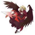
Well long story short, I like the idea of having the back image of MU struggling to get away from his angry self on the front of the shirt.
[color=#ff0000]"“That's the difference between me and the rest of the world!
Happiness isn't good enough for me! I demand euphoria!” "[/color]
16 years ago
Posts: 4764
I think it's a shame to take the little one's biting "com" off~
Hrodulf and Bjornolfr, you will not be forgotten.
[img]http://i411.photobucket.com/albums/pp199/SyberAngelGabrielle/couplesig.jpg[/img]
[color=black]And if the world were black and white,
you would be my rainbow in shades of grey.[/color]
If I had a fantasy self, it'd be a tentacle monster.
