


Mu T-Shirt
16 years ago
Posts: 340
love love love it. 🙂 🙂 🙂
So basically to vanquish the world of evil you must have mega sex with a girl then your soul is taken...yes
16 years ago
Posts: 1705
Um... If you don't mind, I went ahead and played with the layout of version 1(with the newer versions' fonts) because I just wanted to see how it looked with a few changes. I actually really liked the original left side with the big and little guy, but also thought they took a bit too much space, no offense. Please keep in mind I used MS Paint, so this is a very rough draft.
left-style:
V1.1
V1.2 (changed "Updates" font colour)
centerd-style:
V1.3
V1.4 (changed "Updates" font colour)
centered-style 2:
V1.5
V1.6 (changed "Updates" font colour)
edited.
btw, I just have to say I like how Caliber's V2.23 put the "Madness" part in the front. 😃

16 years ago
Posts: 69
a beautiful t shirt i would buy if i had money
16 years ago
Posts: 1705
Ehehehe, oops...
I got too carried away with playing on Paint and ended up trying out some different layouts because I was curious how it would look (I hope you don't mind, Blak. 😕 )

16 years ago
Posts: 166
Quote from Hermit-chan
Quote from Dragonfiremule
Quote from gati
[url=http://img.photobucket.com/albums/v432/gati-chan/Pics/bakaupdatesshirt-01.jpg]shirt[/url]
Yep, thats what I meant.
I like the crowded one as well, but it would be nice to have both as an option, eventually.
Oh wow! This is impressive too!
Just that SINGLE image suits well with the "Partake the madness" word. And I'm loving the red and orange font. This is very standing out.
i like gati's rearranged version too!
it's fresh and simple, and the red & orange font colours are a better combination imo. 🙂
16 years ago
Posts: 104
as a scanlator I think we should be above the updaters!!!
nah I'm kidding XD
where can I buy this shirt?
My Top manga:
- Yu-Gi-Oh!
- Death Note
- Fullmetal Alchemist
- Bakuman.
- Love Hina
16 years ago
Posts: 963
coolness
why because i am the president of the student council of course
[img]http://i707.photobucket.com/albums/ww73/chewy_bubble2004/2d360793.gif[/img]

16 years ago
Posts: 3888
I.WANT.
Mail me one blak <3 =P
♪MONSTARR~ will eat all your cookies and steal your bishies~♪ Φ_Φ

16 years ago
Posts: 23
16 years ago
Posts: 89
i'm not going to the anime expo. but i like the t-shirt idea 🙂
here's my version... see if you like it: http://img79.imageshack.us/img79/3329/tshirttemplatev4.png
it's not done right... but i made it so that you get the design.
changes:
change the "baka" color from blue to red on both front and back.(same color as one of the previous t-shirts.)
resized the Baka manga updates sign.... made it smaller to fit the t-shirt... and for it not to be on the shoulders.
moved the "the mu community" a little down.
should add a "join" a little above it.(same font, same color.)
added the mu main logo from the front... put it at the bottom of the back. .... not the exact bottom.. since it would look like shit.
added a hierarchy between the mods, admins, whatever. (you can see the arrows, that's the hierarchy lol. i added that so it doesn't look like one of those firm t-shirts some people were talking about.) i think it looks better this way.... like a single image. (since i'm a scanlator... i'm not really fond of being below an updater. cuz mainly..... we're the ones that scanlate and provide the stuff for you.... and once we're done.... we're also the ones who update. but meh whatever....)
deleted the "s" in "scanslators"
should add an "s" on forumites.
oh i also resized everything except the "baka manga updates" sign, and the main logo from the bottom. resized it to get a little more space, and to fit better in the t-shirt.
Let me know opinions please 🙂
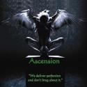
We deliver perfection and don't brag about it.
16 years ago
Posts: 46
tbh, the back looks too cluttered. something as simple as this would've been fine with me actually:
http://i28.tinypic.com/29c83ea.gif (without the silver flames under the arms)
i changed the logo's color in that pic to match the site's layout's color because i thought it gave the design a more home-y feeling.
but your designs for each level of the community can't go to waste. i agree a lot of what CatzCradle's done in those versions of "center styles"
I wish our profiles had a description section.
16 years ago
Posts: 6221
Quote from eternalight
tbh, the back looks too cluttered. something as simple as this would've been fine with me actually:
http://i28.tinypic.com/29c83ea.gif (without the silver flames under the arms)i changed the logo's color in that pic to match the site's layout's color because i thought it gave the design a more home-y feeling.
but your designs for each level of the community can't go to waste. i agree a lot of what CatzCradle's done in those versions of "center styles"
Well, that was pretty much what I had at the beginning...just added the different community mascots since it seemed empty...but if everyone's okay with it being simple then we can go with this one though I'd put the big head in... 🤣 and a MU logo on the front same as the original.
16 years ago
Posts: 50
Is there a timetable for when the MU shirts would be available if you wanted to buy one, personally I liked the original V2 and putting some serious thought into buying one of the shirts if I could.
"I came to laugh at you!" - Chars Aznabal
16 years ago
Posts: 2172
sniff
but i liked those group mascots~!

16 years ago
Posts: 3380
Quote from aneste
sniff
but i liked those group mascots~!
Gotta agree with aneste here...
I was expecting something...more
