
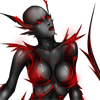
http://fc04.deviantart.net/fs71/i/2012/159/a/8/shizaya_by_storm chained-d52t40n.png
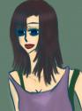
http://fc03.deviantart.net/fs70/i/2013/034/c/c/halibel_under_the_ stars_by_stormchained-d5tqxjo.jpg
also videos of few timelapses:
http://youtube.com/user/stormchainer
wonder if anyone around here could gimme few tips or pointers =] thanks! >_<
________________
http://stormchained.deviantart.com/
Friend me all around x]

Manga Poll

Manga is the Japanese equivalent of comics
with a unique style and following. Join the revolution! Read some manga today!
Join #baka-updates @irc.irchighway.net
RSS Feed
Forums
Need feedback on my digital art!
You must be registered to post!
From User
Message Body
Member
9:57 am, Feb 15 2013
Posts: 4

2nd wave MU user
 Member
10:52 am, Feb 15 2013
Posts: 7784
Not bad, but I think you should do something about the hair to give it depth, probably some shine, for example, the sideburns in the second pic. You don't leave the bodies flat in tone, so the hair should follow the same style to me. Sort of conflicting otherwise. You did it well on the top of the head though.

Mome Basher
Member
2:28 pm, Feb 15 2013
Posts: 3380
Hope you don't mind me asking, but...is Halibel supposed to look pregnant?
Also, I think that her legs (from hips to knees) need to be longer too. The proportions seems a little off.
I somewhat don't agree with the hard white (?) back lighting either. Make it more subtle. She looks like she's sitting in a bush of some sort so light shouldn't be bouncing that much and that hard near the ground, especially since its a night setting. Other than those, they're looking pretty good!
________________

Everyday I'm tumblin'
Also, I think that her legs (from hips to knees) need to be longer too. The proportions seems a little off.
I somewhat don't agree with the hard white (?) back lighting either. Make it more subtle. She looks like she's sitting in a bush of some sort so light shouldn't be bouncing that much and that hard near the ground, especially since its a night setting. Other than those, they're looking pretty good!
________________
Everyday I'm tumblin'
Member
3:45 pm, Feb 15 2013
Posts: 167
your skin coloring is REALLY good...but the drawing part has something left to be desired.
________________
KanataxYuki will always remain in my heart...
Their love is so profound~!
CrangolaFango
________________
KanataxYuki will always remain in my heart...
Their love is so profound~!
CrangolaFango
Manga Eater
Member
4:39 pm, Feb 15 2013
Posts: 442
I'll point out some things I've noticed.
You need to add depth!!
For both (especially the first one) it looks too chaotic -- you need to have some sort of backlighting that pushes them out of the background. But the hair and the clothes don't have a lot of value, so they look like they all have equal lighting (which is untrue, realistically). I suggest doing some value studies so you can get a feel for how shadows work to make an image "pop".
For the second one, well.. I'd recommend looking at some female anatomy references. Waists aren't that small in proportion to the rest of the body (at least, I hope not). Secondly, the stomach... is a bit confusing, especially with the lighting. Is she supposed to be pregnant, as someone else pointed out? Thirdly, her neck's too long, as are her arms. Fourthly--where are her feet?! Don't hide parts of the body you don't want to draw! They still belong there!
Also keep a consistent light source! For the woman, the light falls on her face and onto her breasts at different angles.
There's also colour theory, but I find that hard to relay to others. [Look it up if you feel inclined]
For the most part though they're pretty good. Keep practicing and you'll be fantastic!
Here's some good references for you:
Fantastic value study:
http://browse.deviantart.com/art/Value-Study-2-283054635
Female anatomy:
http://fc06.deviantart.net/fs12/f/2006/329/2/3/Female_Anatomy _Patterns_by_Snigom.jpg
________________
Go to work, send your kids to school;
Follow fashion, act normal;
Walk on the pavement, watch T.V.;
Save for retirement, obey the law.
Repeat after me: I am free.

jail bait
Member
12:50 pm, May 11 2013
Posts: 1444
pretty good. i like the first one. halibel has a stomach bump. weird.
________________
oh please do click this!
The sweeter the apple, the higher the branch. The quieter the fart, the nastier the smell.
GUESS WHO??
________________
oh please do click this!
The sweeter the apple, the higher the branch. The quieter the fart, the nastier the smell.
GUESS WHO??

Hardcore
Member12:55 am, May 20 2013
Posts: 143
Hm, the colors of both the pics are pretty good; emitting enough dark essence.
The first pic is perfect but there're a lot of questions to the second one.
I'm pretty much not satisfied with her lips and the chest and the abdomen look weird.
Ditto Scyfon's comment about the pregnant part.
The first pic is perfect but there're a lot of questions to the second one.
I'm pretty much not satisfied with her lips and the chest and the abdomen look weird.
Ditto Scyfon's comment about the pregnant part.
You must be registered to post!
